The main screens
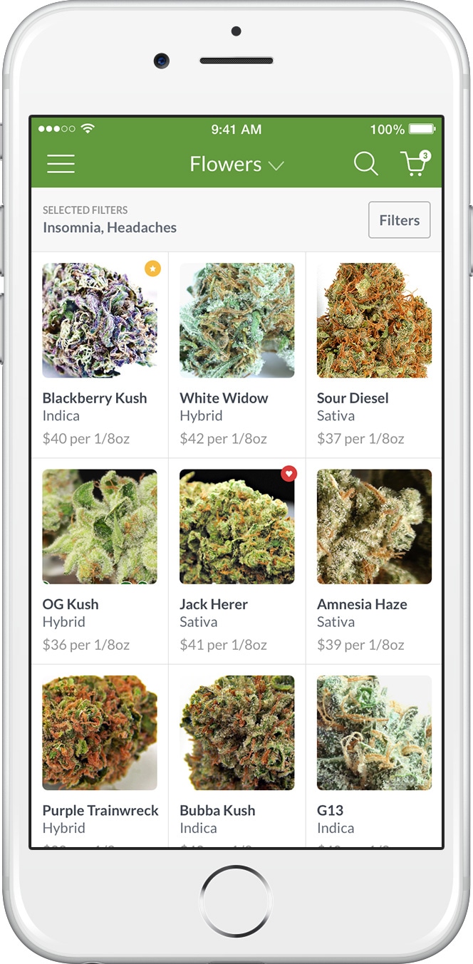
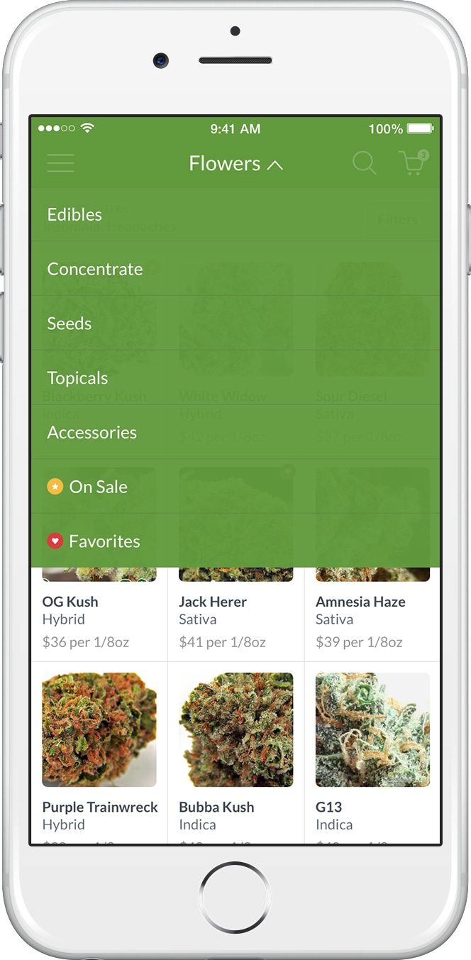
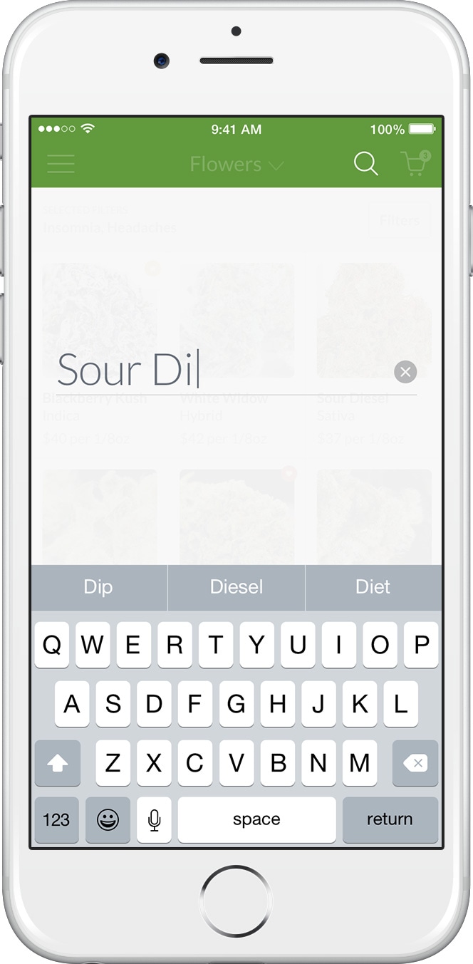
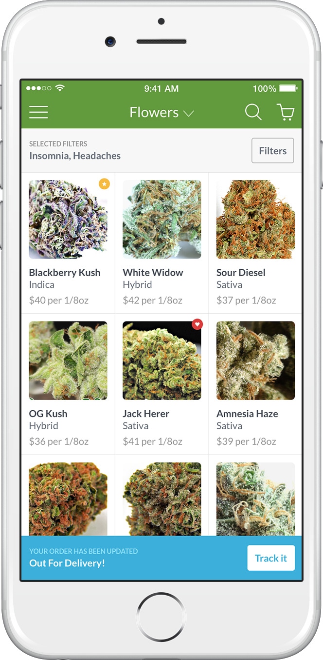
Shop, categories, and search: colors,
font sizes, and product listing layout were determined by running multiple
A/B tests. For the listing, it turned out that a grid arrangement
slightly increased the conversions, thanks to its professionally shot
pictures.
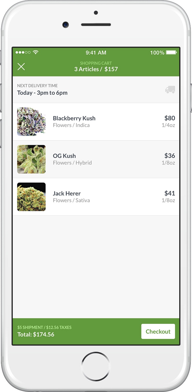
Details and cart
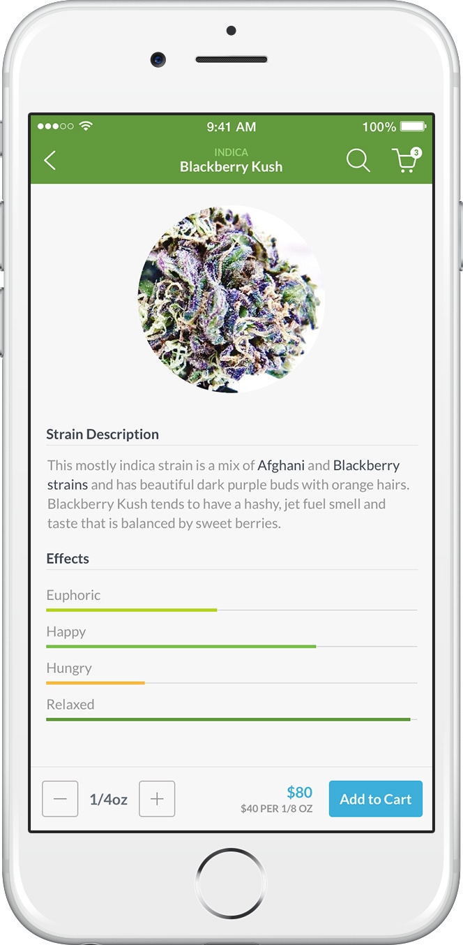
The details screen shows an accurate breakdown of the effects and
pathologies treated by the specific strain. Those aspects can be also filtered from the
listing screen itself. These specs were crucial to highlight the
medical connotations
of the app.
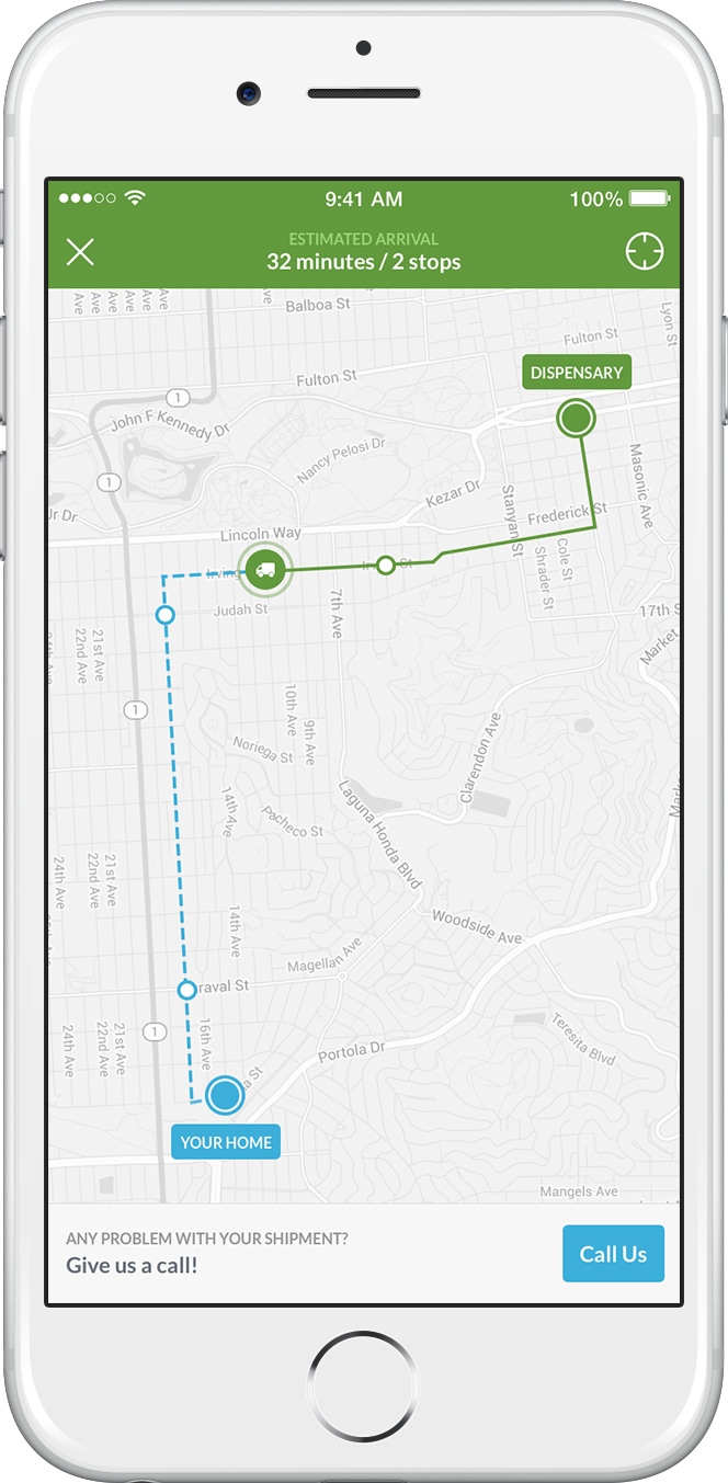
Shipment tracking, in real-time
The real-time tracking doesn't just provide the actual position of the
carrier, but also a way to call the dispensary. Needless to say, the
"call us" button was tapped everytime the carrier slightly modified its main route. To
avoid that, a soft-alert was implemented later on.
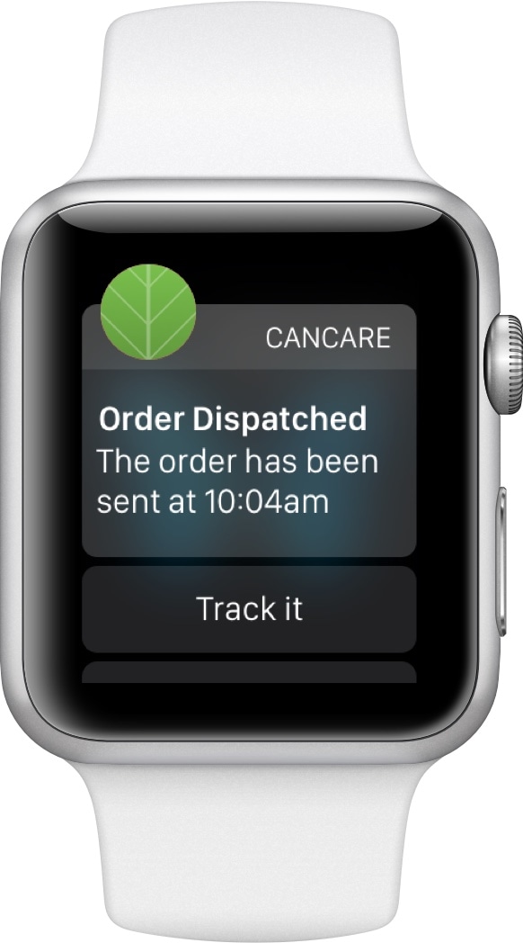
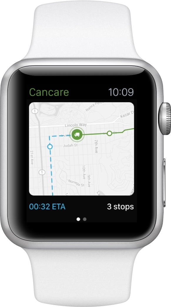
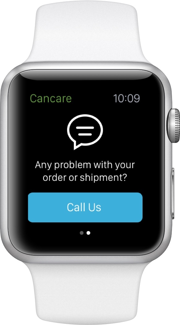
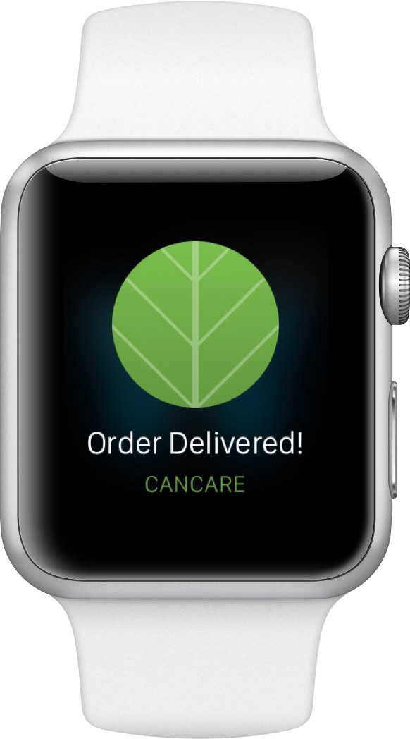
Apple Watch tracking
Considering the limited capabilities of wearable devices, the Apple
Watch app focuses solely on the tracking feature. This version was
designed as a proof of concept, since the App Store doesn't allow the publishing of
these kind of apps.
